UX Design for mobile app for creating shareable travel itineraries
Written by Agustina Feijóo and Lucila Díaz Spólita for The UX Department. The original version was published at www.theuxdepartment.com
Mar 2014 - May 2015
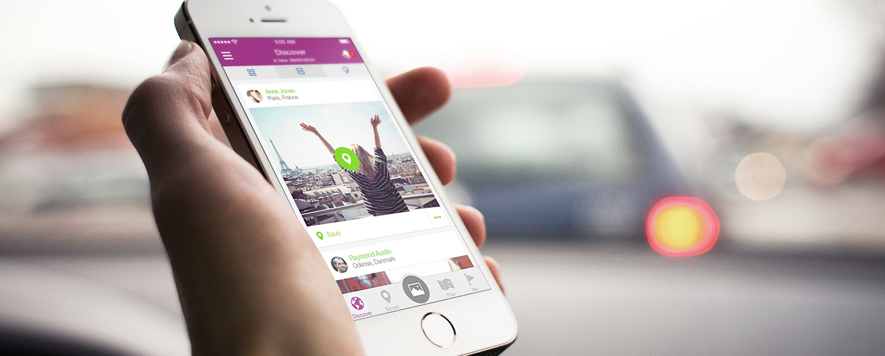
Overview
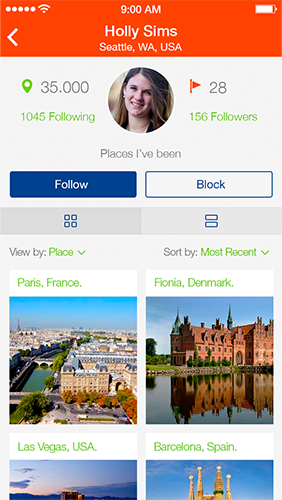
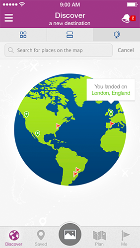
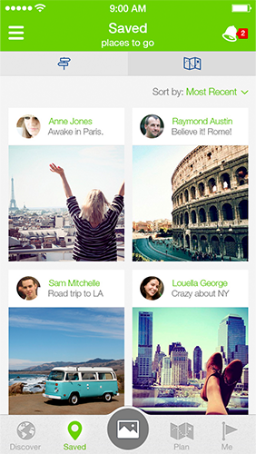
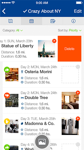
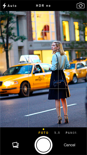
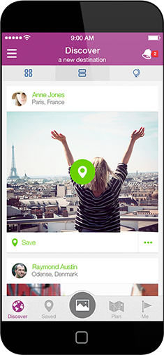
Globespinning is a mobile travel app that lets users create and share itineraries from pictures taken on their phones.
The founders of the app decided to work with The UX Department to create a mobile app and accompanying marketing website. The goal was to organize the required functionalities in a way that was intuitive and comprehensible. We helped define functionalities and user flows within the app, and designed the necessary visual styles.
Visit website View app in the iOS App Store View app in the Android Play Store
Services provided by the agency
- Research & Concept Definition
- Information Architecture
- Interaction Design
- Visual Design
- Front-end Development
Roles and responsibilities
The team for this project consisted of the following members:
- Mariano García: Creative Director at the agency and the leader of this project.
- Agustina Feijóo (myself): I participated as project manager and UX designer. Will specify my contributions below.
- Lucila Díaz Spólita: Visual designer. Was tasked with producing the high fidelity mockups for the app and website.
- Andrea Gallo: Front-end developer who implemented the marketing website.
My role
In this project, I acted as:
- Project manager: Was the liaison between the client and our team, organizing our resources and making sure all deliverables and deadlines were met.
- UX designer: I led the discovery and research phases, gathering and digesting all the existing documents sent to us by the clients, understanding the expectations the clients had for this project, and I laid out the structure of the app (information architecture and wireframes) under the supervision of the Creative Director.
Context and Challenge
Project background and description
Globespinning, Inc. is a Seattle-based company run by two sisters, Mandy Rossi and Amy Boes, who travel often and were constantly being asked to share the details of their trips with their friends. Seeking to inspire others, they created Globespinning for all types of travelers, from detailed planners to spontaneous trippers.
We worked with the founders for over a year to build a mobile application for iOS and a marketing website.
The problem
Globespinning’s creators wanted to develop an easy-to-use mobile application that would allow users to carefully plan out their trips with help from other users, and then document their own trip.
From personal experience, they had the hypothesis that users would feel more comfortable making important decisions about a trip if those decisions were based on recommendations from people they knew and respected. They also believed that word-of-mouth would play an important role in setting the product apart from any other available option in the market at the time.

Project goals and objectives
Our goal as a UX design studio was to elevate the founders’ vision of the potential of the product by determining key features to include, defining clear user flows within the app, organizing the planned functionalities, and creating a visually appealing interface.
The features to be included were:
Users and audience
The target market was women and men between the ages of 20 and 40 who were frequent travelers keen on improving their travel experiences. The app would let them rely on the advice of people they knew to do so, and then share their own travel experience to help other users improve theirs.
Process
Discovery phase
The founders of Globespinning provided a very detailed set of materials to illustrate their vision of the product, including low fidelity wireframes and notes.
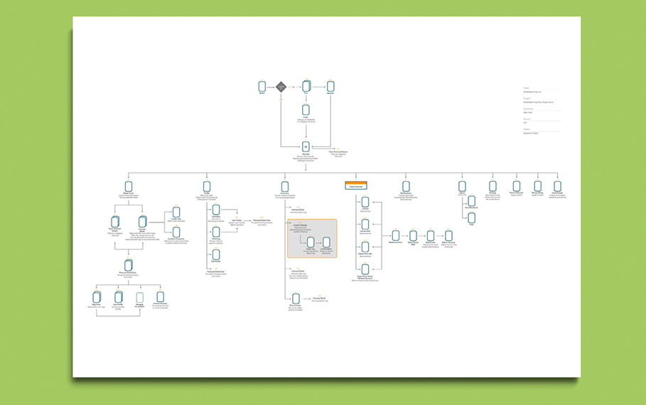
From these documents I started working on the information architecture for the app. This phase went through a series of revisions and corrections that improved the user flow and made the app as simple and clear as possible. We revised our proposed adjustments with the client and agreed on a set navigation that included the planned features.
At the end of this process we delivered the information taxonomy document (application map) including all the key pages and functionalities of the app.
Interaction design phase
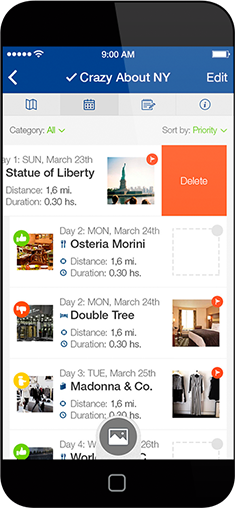
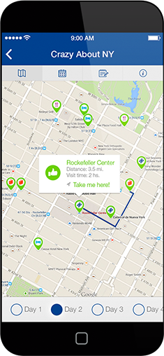
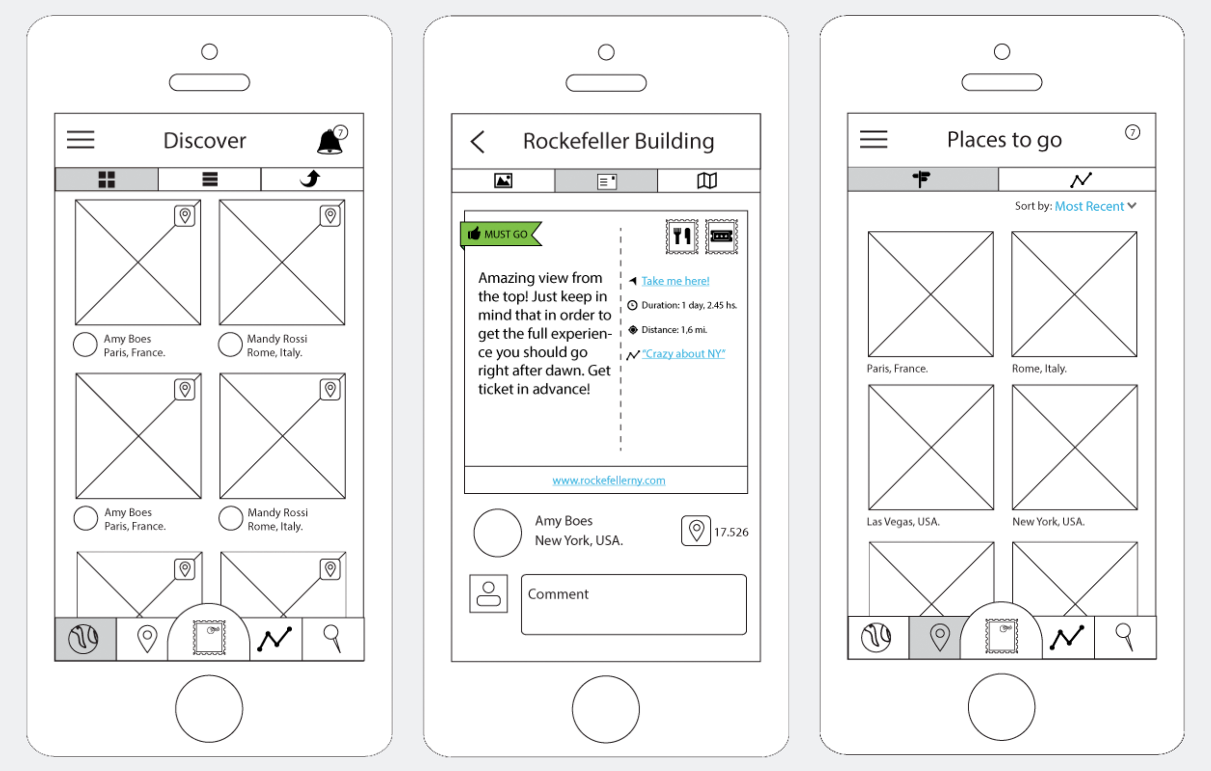
Once the app map was approved, I started our interaction design work. I created detailed and color-coded wireframes that displayed the structure and functionalities embedded in each screen of the app.
I designed around 80 screens, which were changed many times along the way. During very thorough client meetings, we discussed the different use cases of the app and cleansed it of all miscellaneous features to leave only the core features necessary for the MVP. Some screens were set aside, others were combined, and some were added.
At the end of this process I delivered the wireframes (low fidelity mockups) for all the key pages of the app and created a clickable prototype that was revised by the client and adjusted accordingly.
Visual design phase
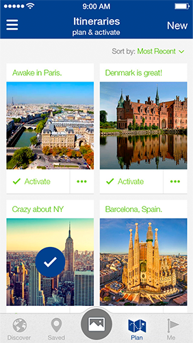
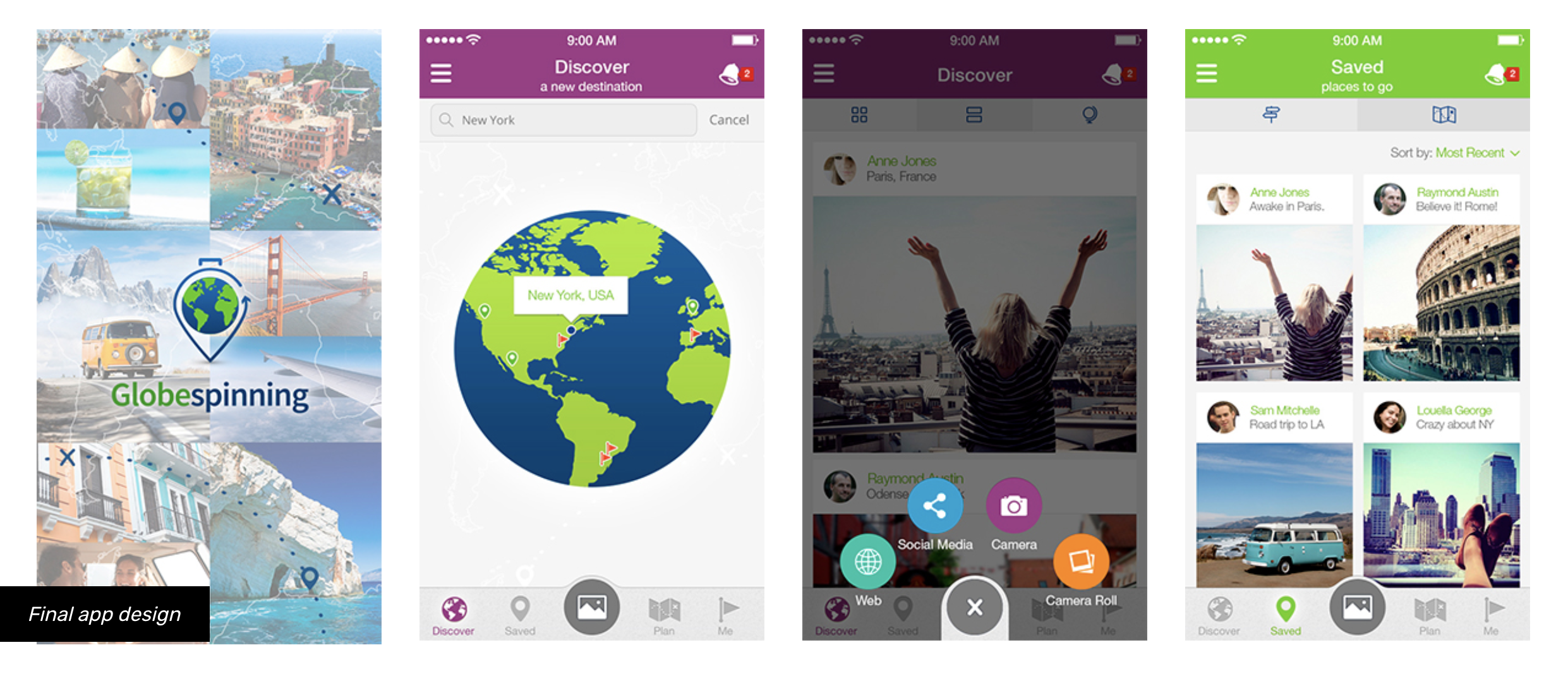
After several weeks of intense work we moved on to the visual design phase of the project, led by Lucila Díaz Spólita. In this phase, the app icon was created, as well as a general style guide that defined the look and feel, color palette, iconography, illustrations, clickable elements, and more.
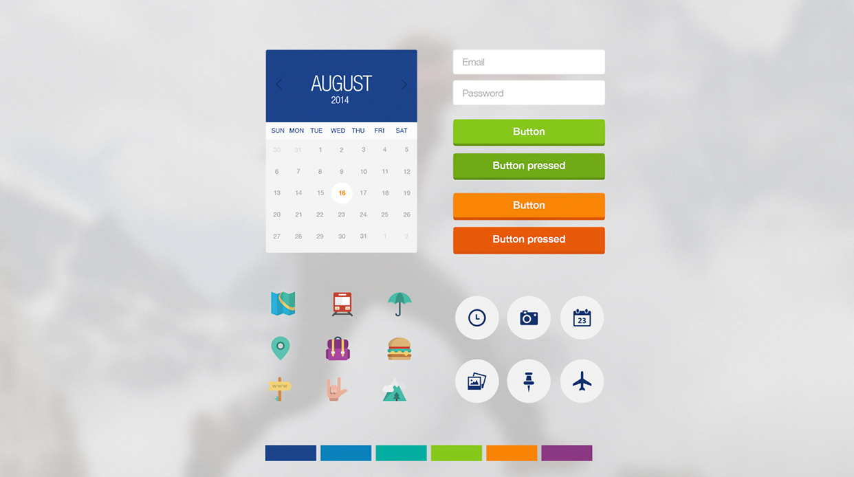
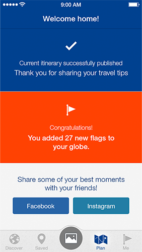
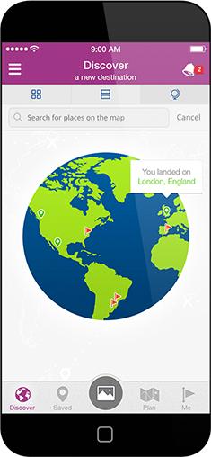
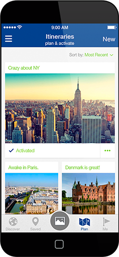
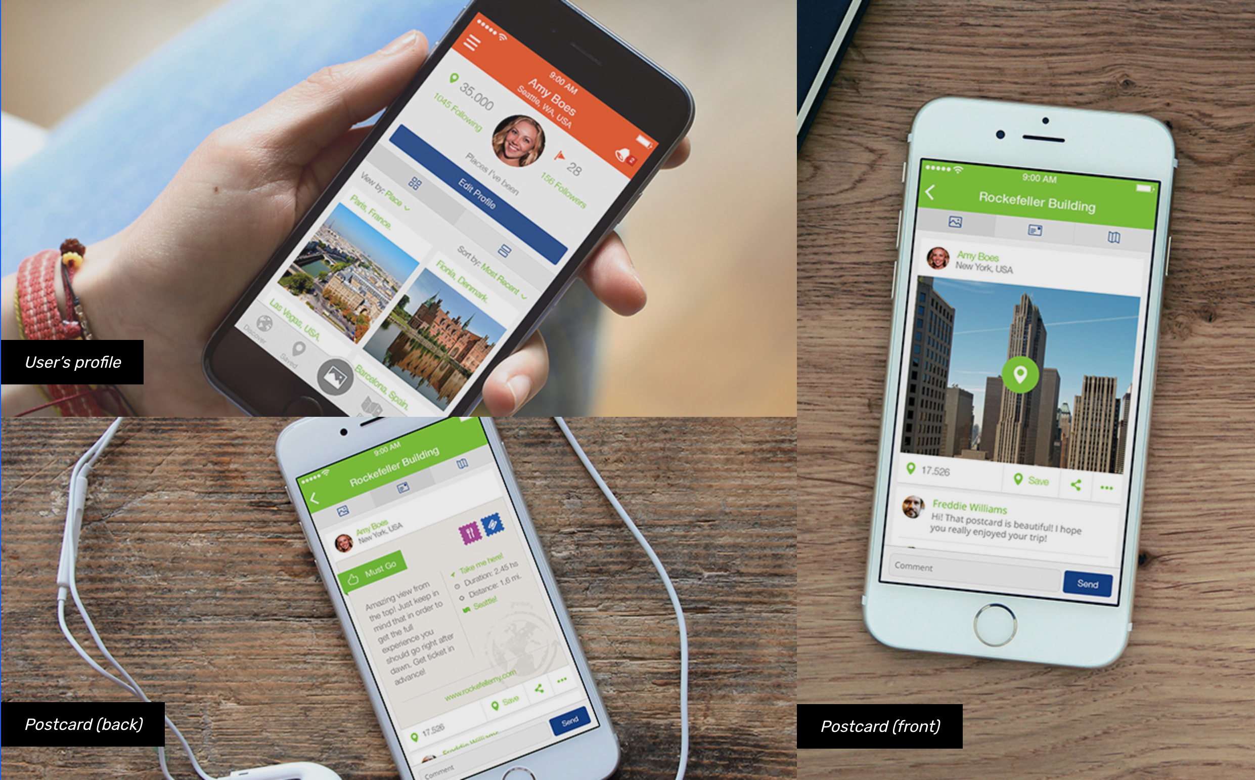
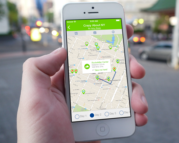
Once the look and feel was approved, Lucila worked on the design of the entire app. We decided to use color as a visual tool to set sections apart and make them easily distinguishable by the users. We also used color coding for tagging and filtering the postcard system.
We delivered high fidelity mockups for each of the mobile application’s screens, and all of the exported assets, ready for implementation at every screen resolution.
Collateral
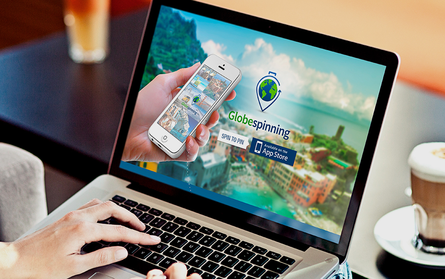
We then worked on the brand, interaction design, visual design, and front-end development of a one page marketing website that served as a teaser until the app launched, and which is still live and points to the Play and App stores.
Scope and constraints
Back then, the agency did not offer UX Research of Usability Testing services. Those services were added a little while later after I took a personal interest on the subject (started studying, reading books and taking courses), and I proposed the idea of offering these services to management. Thankfully, the idea was well received and we conducted various forms of UX Research on other projects over the years. The research efforts were always led by me.
Similarly, since the agency did not offer native iOS and Android development services, the client started working with another agency to fulfill this need and implement the app.
Proposed solution
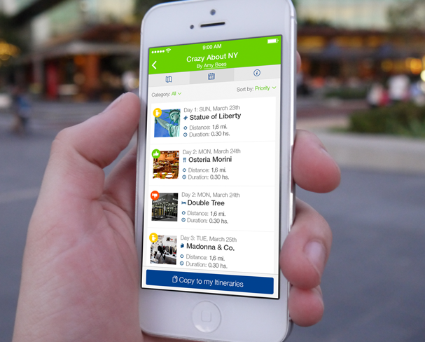
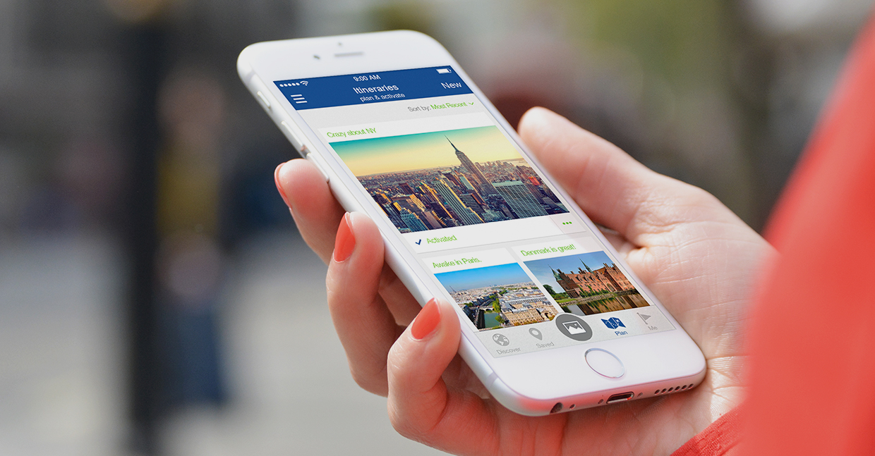
Testimonials
"Dear Agustina, Thank you so much for all of your hard work on Globespinning. We realize you are the mastermind on figuring out how to make Globespinning work. You are so talented! We miss talking to you every morning. Thanks again! Hugs & happy globespinning!"
"We really enjoyed working with them, it was fun! We appreciate that they didn’t just settle for the original wireframes we provided, but they committed to making the user experience better. They improved our vision. Also, they were always quick to reply and very thorough in working on every feature of the app."
MANDY ROSSI & AMY BOES – FOUNDERS – GLOBESPINNING
