Diez — User research for product idea validation
Written by Agustina Feijóo.
Dec 2018 - Feb 2020
Overview
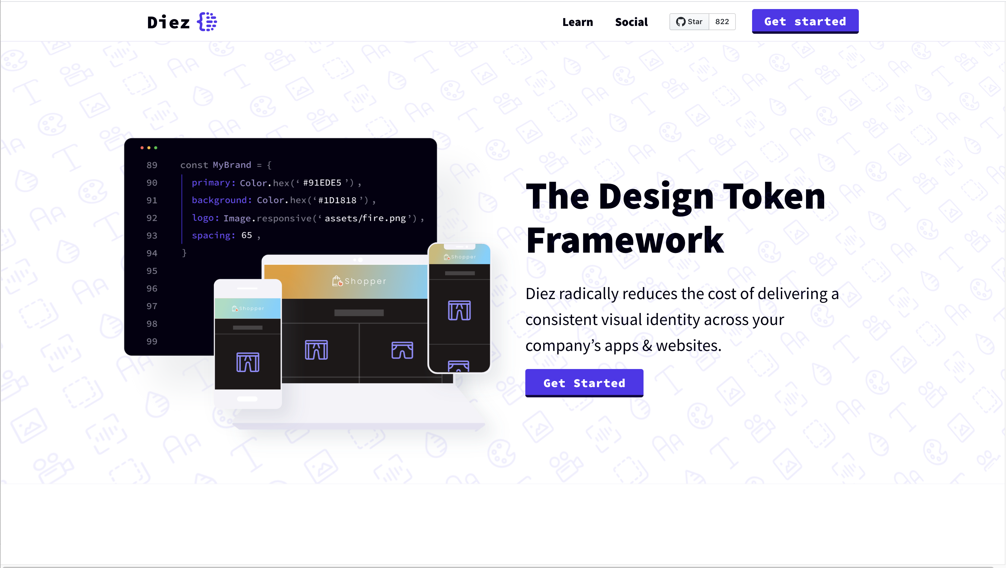
Haiku for Teams seeks to help teams improve their collaborative processes through innovative tools. One of the products born from that initiative is Diez, the design token framework. Diez is a free & open-source developer toolkit for expressing visual styles that can be shared across codebases, native platforms, and teams. It reduces the cost of delivering a consistent visual identity across a company’s apps & websites.
My role
I advocated for and led this research effort.
Problem statement
This was an ambitious project that sought to bridge the gap between design and development to achieve a better and more seamless collaboration when building and maintaining design systems. The goal of this research project was to identify the needs and wants of our potential users and to validate or invalidate the product idea before committing substantial resources towards building a complex technology that so far did not exist.
Users and audience
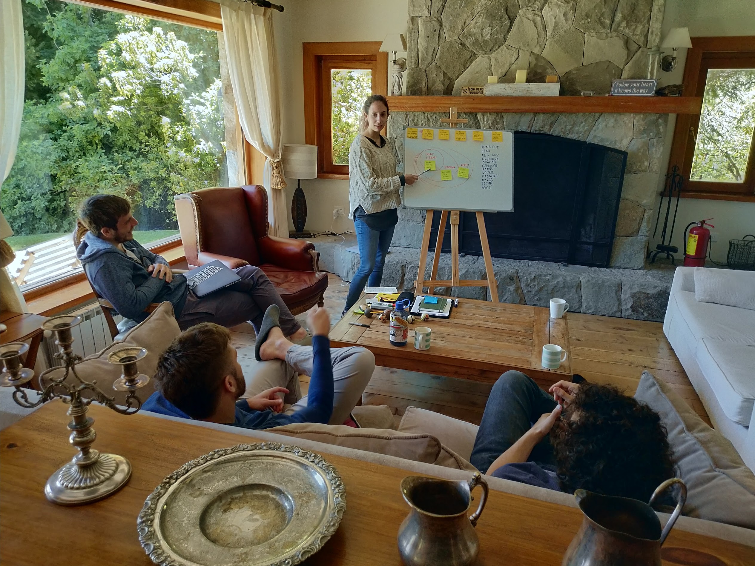
During our first company summit, I facilitated an on-site workshop during which we uncovered three proto-personas we thought this product would serve, and we stated our assumptions and hypotheses surrounding their needs and current pain points. In short:
- Pablo, the developer: He wants to finish his work and leave the office on time, wants to reduce repetitive work to be able to focus on more important issues and wishes designers could make all the nit-picky adjustments they'd like on their own.
- Esmeralda, the UI Designer: She wants all the hard work she puts into her designs to be respected by developers and implemented properly. She is frustrated by having to go back and forth and pin-point all the places where the implementation needs work. She would like to have more control over the finished product.
- Anne, the project manager: Anne works long hours and feels the pressure of having to take responsibility for what the team does and does not accomplish. She wants deadlines to be met, projects to stay within budget, and clients/stakeholders to be happy with the results.
Scope and constraints
Our team aimed to create a new technology that would seamlessly connect the design files (Figma, Sketch, Adobe XD) with various native codebases through a TypeScript design token framework. This would require a massive effort, especially for a small team like ours with a tight deadline. It was, then, paramount to validate our assumptions via research.
This research effort sought to obtain both qualitative and quantitative data to prove or disprove our hypotheses. Due to the limited resources the company had to allocate to this research project, I worked on it mostly alone, planning, executing and presenting the findings to the rest of the team.
Process
We started by gathering our assumptions about the product's audience
In the beginning, there weren't any certainties regarding who our users would be. We had ideas, thoughts and assumptions, but no data yet. To start, I facilitated an in-person workshop during the company summit, in which the team collaboratively defined our proto-personas, including:
- Demographics
- Wants
- Needs
- Goals
- Pain points
- Behavior
- User group hierarchy (core users, stretch, step 1, etc.)
- Brand archetypes
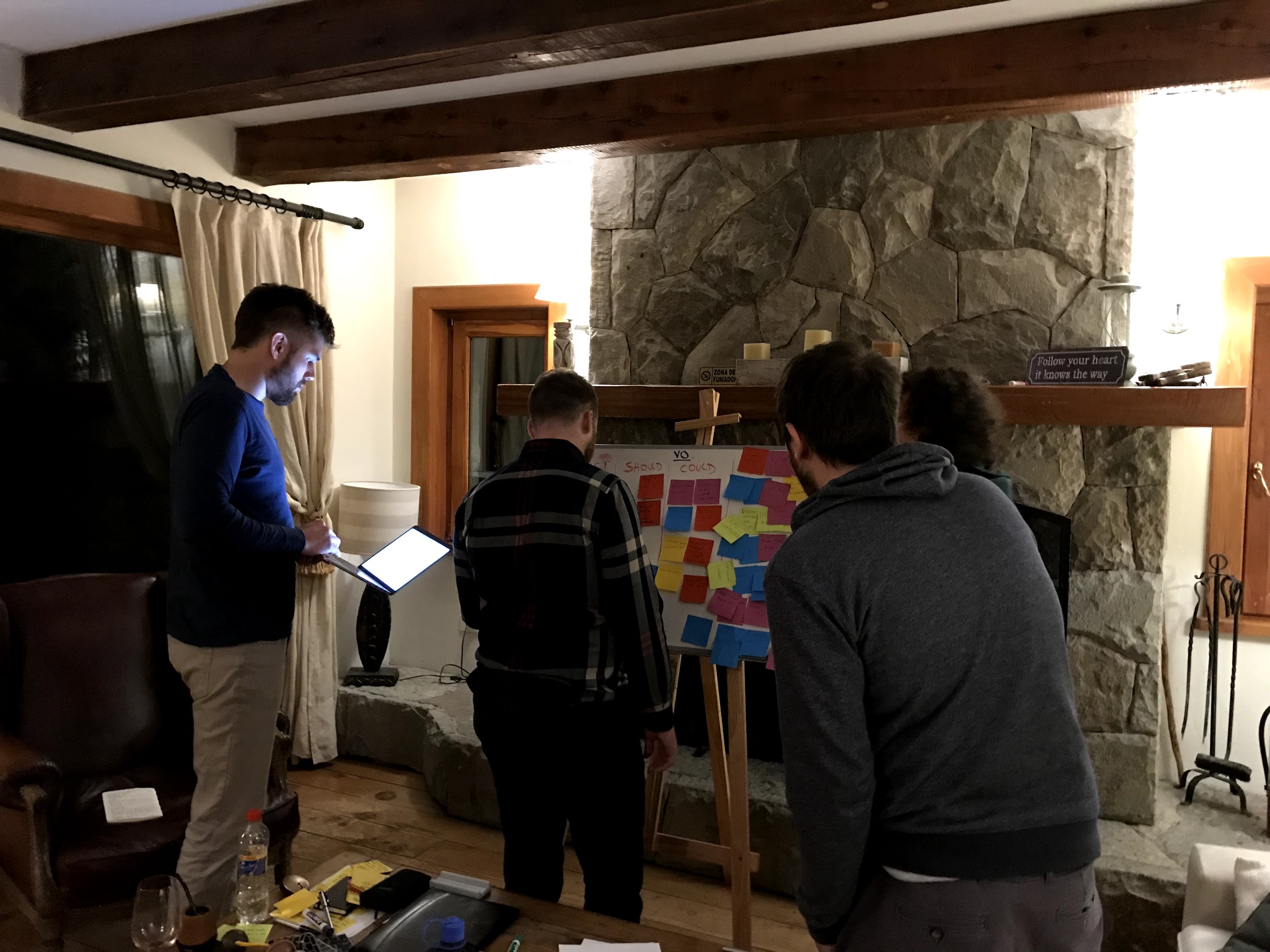
During our week in Patagonia, I also facilitated two other workshops:
- Brand personality
- Feature ideation and prioritization
All of the insights from the workshops were expressed and presented to the team in the form of reports, to guide our future efforts.
Converting proto-personas into personas through interviews with representative users
Once we had put together our assumptions, it was time to test them. I set out to plan and execute ten remote interviews with representative users to learn about their actual needs and pain points when collaborating with other disciplines to create and maintain design systems. That knowledge would allow us to course correct, if necessary, or to find ways to better serve their real needs.
To start, I crafted a one-page plan covering context definition, hypotheses, objectives, research questions, methodology, team, participants and timeline; I put together the brief and script for the interviews; crafted a screener to filter potential participants; selected and scheduled interviews using User Interviews and set out to start talking to people. I facilitated all ten interviews, having co-workers sometimes join in and ask follow-up questions as well as help with note taking.
After the sessions concluded, I proceeded with the open-coding process to extract meaning and concepts from the answers the participants provided. Once I had broken down the collected data into codes, I used the KJ technique (or affinity diagram) to look for patterns and group them accordingly.
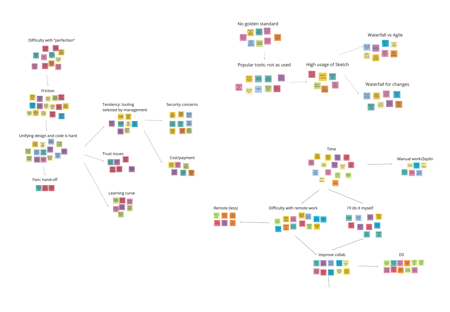
This type of work is best done by a team of people, not only because it's faster to process, but also because having more eyes on the data can help keep it as objective as possible, since it forces researchers to seek agreement on the meaning derived from user quotes. However, because of the time and resources allocated to this project, I did this part by myself, crafted a report and presented it to the team.
The main findings we uncovered during this process included:
- There is tension between designers and developers, apparently originated in the fact that, due to the differences in their workflows and mindsets, they value different things when building a product, or in this case, a design system.
- Developers expressed they feel designers want to “reinvent the wheel” and focus too much on fine and unimportant details. They also feel left out on certain decisions and not trusted with making small design calls. On the other hand, designers feel developers “don’t care” and claim to have finished implementing something when, in reality, it doesn't match the design as much as they'd like.
- Swift collaboration is also impaired by the fact that designers and developers work in their own subset of tools, which are not connected, so a third group of tooling is necessary to connect workflows and keep the team in the loop.
- Matters are worsened a lot of the times, because tools are chosen by the management of the company and forced down on the product teams. In hindsight, this should have been a red flag for us and something to look into in more detail.
The initial research indicated that our assumptions regarding our target audience and their needs were correct, so the team move forward with implementation while I looked for further validation
The team began working on the MVP for the product. While that process was in the works, we decided to try and obtain further validation, this time in the form of quantitative data. Since the product didn't yet exist we created a landing page with information about what the product would do, and a form to sign up for the private beta our team would launch in the upcoming weeks.
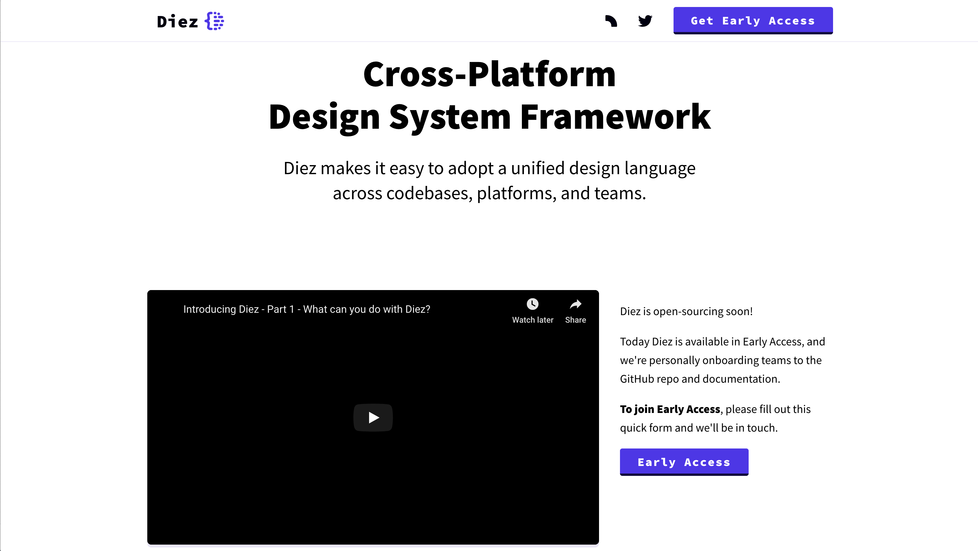
To access Diez private beta, subscribers were asked to complete a survey. We wanted to gather more information about the current needs and pain points that these people and their teams were facing when building and maintaining a Design System. This information would help us move forward in the validation process and it would also provide insights to guide feature prioritization.
It is widely known in the community that a survey is the easiest research technique to do wrong. From biased or leading questions, to asking participants to guess the future, and to confusing scales, it is very easy to get misleading data (unless you are a highly trained surveyor). Despite this, the team decided to move forward with this technique, because it was the best (if not the only) tool at our disposal for collecting quantitative data at the time. We needed to make the best of it.
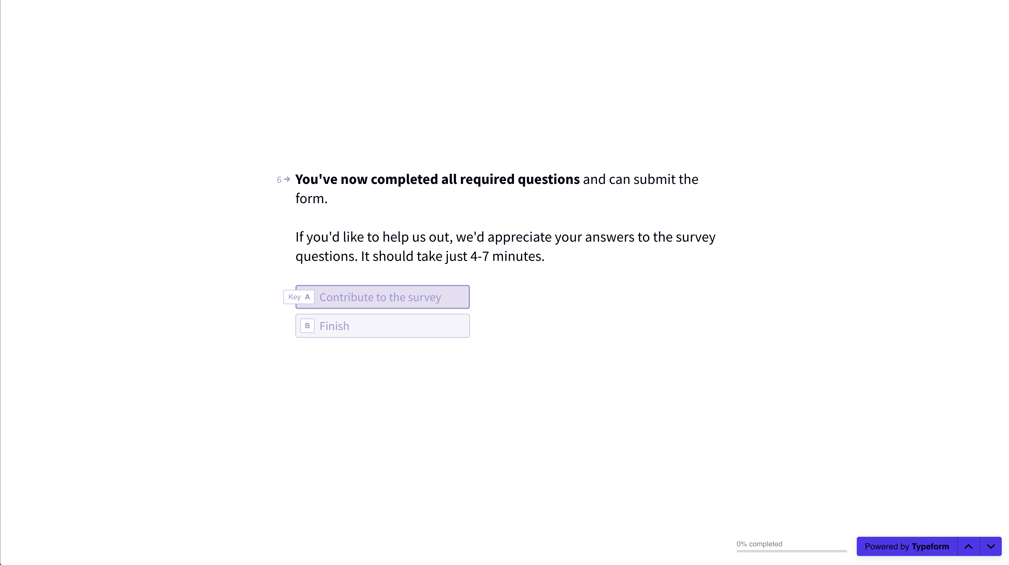
The private beta form included some filtering questions to help our team prioritize who would get early access to the product, as well as questions to help us get more data on the collaboration dynamics in companies building and maintaining design systems. We wanted to learn:
- Did the respondents collaborate with people from other disciplines regularly? If so, with whom?
- Did their company build and maintain a design system?
- How complex or in-depth was this practice?
- How large was the team allocated to this task?
- What codebases did their design system support?
- What technologies and tools did they use?
- Did their current tools offer any design-system-specific features?
- What were their biggest pain points?
- How would they make it better if they could? What would they add or remove in terms of functionality?
- How did the participants envision a perfect-world design system? What would it be able to accomplish?
We got over 1500 responses to the private beta survey. This level of response, considering the status of the product, and the fact that our team promoted it manually in a select few channels, showed us there was a lot of interest in the idea, or at least, it implied people were resonating with the fact that a better solution was necessary.
After collecting the data, it was time to analyze it and look for patterns
I created a spreadsheet that included individual data sheets containing the responses for each of the five qualitative questions from the survey. Next to each of these, there was a corresponding analysis sheet.
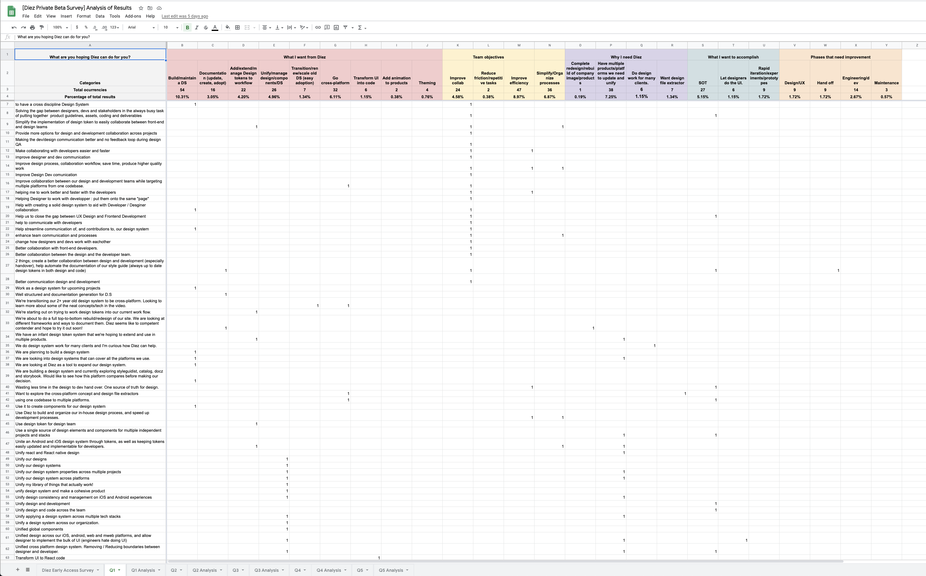
To break-down the responses for each question, I created custom categories. Each category contained multiple variables. These categories and variables allowed me to disassemble each qualitative answer into components that I could later reassemble quantitatively, so that we could understand the story of the collected data in numbers.
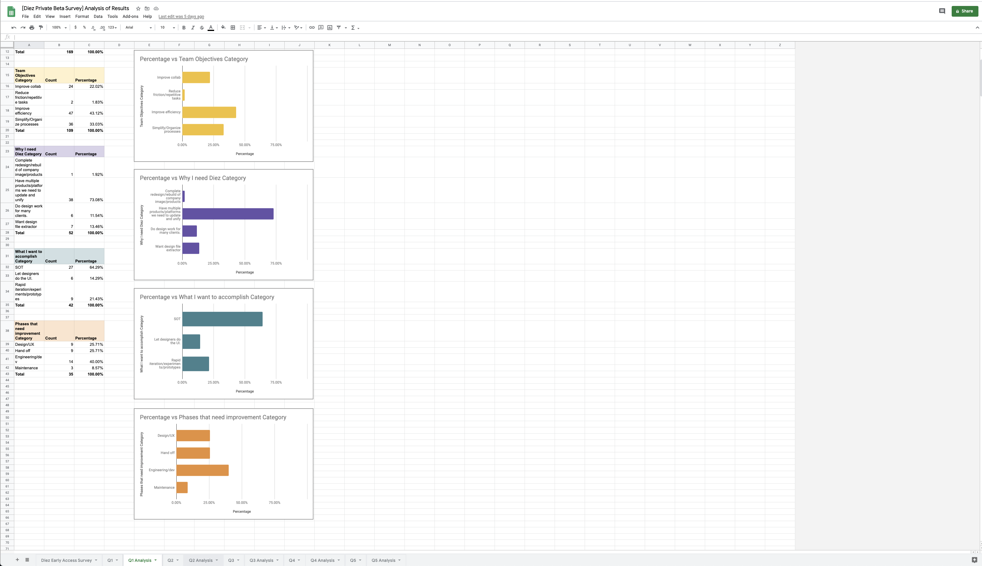
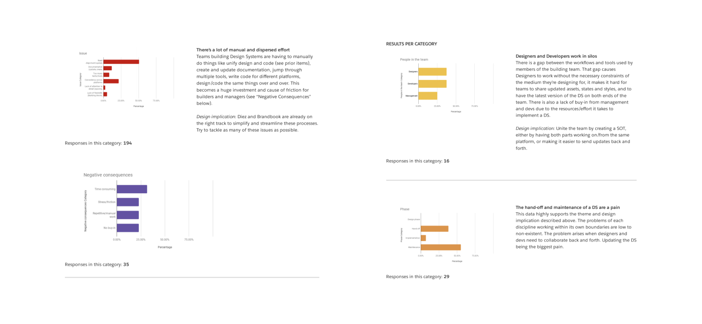
After tabulating the responses, I created bar charts to visually represent the obtained data. Later on, I put together a report that included:
- The survey questions
- Their categories and variables
- Category results: a bar chart with observations derived from the data and the design implications.
During this phase we uncovered, among other things:
- The messaging in the landing page we created for the product was successful. The expectations expressed by our potential users matched our intentions for the product.
- Teams seek to increase productivity, and reduce production times, friction and repetitive work.
- The design to code loop is broken. The source of truth lies in code, and if changes are introduced directly in code, it takes manual work to keep the design files up to date.
- Third party tools are used to bridge the collaboration gap between design tools and developer environments.
- Ease of integration and adoption is key for a product to be introduced in an already complex workflow, even for highly technical team members.
- Consistency across codebases and files is one of the biggest pain points.
We proved the product provided value to our users, now it was time to prove if it provided enough value for our customers to make the purchase
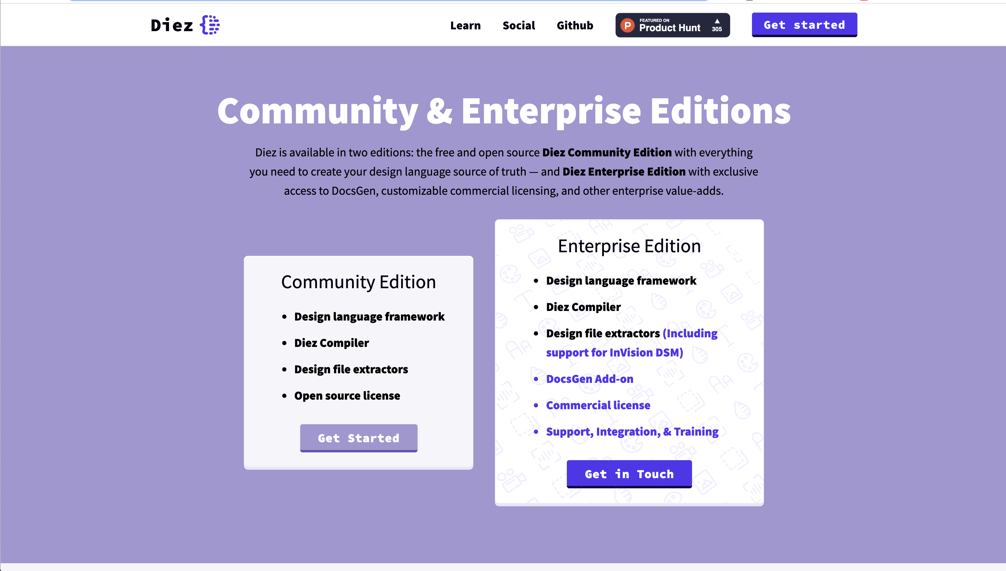
After the company launched the MVP for Diez, we saw the product was well received by teams, and interest was spiking. However, we still needed to find a way to monetize this product. Initially, the idea was for Diez to offer a Community Edition with AGPL license that was free and included some basic features, and an Enterprise Edition with extra features and a commercial license, that offered more freedom using the product. Our hypothesis was that companies would be interested in investing in our product to streamline their teams processes, reduce repetitive tasks, save time and therefore money.
To test this hypothesis, we showcased this offering on the product's website and added a form for interested parties to request more information about the Enterprise Edition. The same as before, the form included filtering questions to help us prioritize who to talk to. The company's CEO/founder and me started a semi-automated sales outreach effort to contact the interested parties and set up calls. These online meetings were planned to cover our research questions (so that we could keep gaining insights into the companies workflows, tooling and difficulties building and maintaining their design systems), as well as a live demo of Diez Enterprise Edition.
During these interviews, the most important insight we uncovered was that our users were not our customers. The people who actually decided which tools the design and development teams would use were not designers and developers themselves, not even product/project managers. It was high-level executives who made this type of call. Even though this had come up during our initial round of interviews, we didn't investigate the implications and impact this would have on our business plan. Now, we were seeing that most of the people signing up for these sales/research meetings were designers or developers who were interested in the tech but didn't have purchasing power. They needed to gain buy-in from their teams, and most importantly, from their top execs.
Outcomes and lessons learned
During this research project that spanned through months of work we were able to learn about the potential users of this product. We validated our assumptions and saw that this tech would provide value to them. We launched the design token framework and saw it grow in the community. We saw professionals talking about it in conferences and professors teaching it in their classrooms. There were even people willing to contribute to this project in their own time. In that regard, it was a success for the company, because this project helped position it as a leader in the design systems space.
However, we failed to pursue further data about the fact that our users were not our customers earlier in the process. Understanding that providing ample value to the product's users didn't necessarily mean that the customers (the leaders of the companies where our users work) would want to invest in this type of technology, led our company to decide to drop the monetization aspect of this product and open-source it completely.
Testimonial
"Agustina is a fantastic product designer who not only delivers meticulously researched UX specifications, but also creates beautiful graphics and documentation. I am constantly impressed by the quality, depth, and originality of her work, and look forward to our next opportunity to work together!"
SASHA JOSEPH – LEAD ARCHITECT OF THE DIEZ OPEN SOURCE PROJECT – HAIKU

